More Fun with GIMP
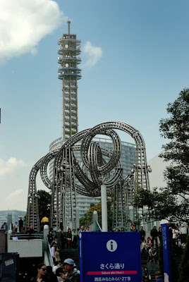
So here's another little project I've been working on with the time I have here in Japan. Check out this picture. I took it up at Queen's Square in Yokohama.
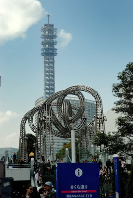 I like this big sculpture they had there. The picture looks good but there are two things that I would like to improve upon. I'd like to bring out the blue in the sky a little more and that tower in the middle is a weird color. I don't know why it looks so different than the other parts but it needs to be fixed. So here's how I did it.
First I tried editing it with Nikon Capture which is what I use mostly, but it didn't work out because of all the little sky peeking through the tower. So that's the challenge. I have to edit the tower without changing the sky inside it and then edit the sky without changing the tower. It's almost like I need to be able to mask it off. Hmmmm..... masking...... Oh, in GIMP there's this thing called layer mask. This is how it works. You start with a background of the main image, then you make copies of that image and overlay them on the background. Then you use this layer mask to make only certain parts of the overlays visible. That way you can edit each part separately. Finally you show all the layers with their layer mask applied and you are left with the final image. This will make sense shortly.
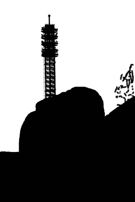
First I have to make that mask of the tower. I use a tool called threshold that turns everything white and black. Here's the result.
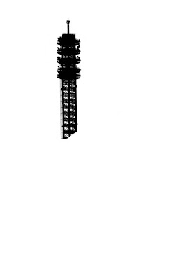 Now I've isolated the tower, but it needs to be the other way around. Using the invert command I get this:
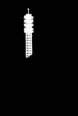 At this point, remember I made an overlay that looked like the original picture. I need to apply the layer mask to the overlay. The point of the layer mask is that part of the layer is visible and part is not. Where the layer mask is white, it shows the layer. With the layer mask applied it looks like this:
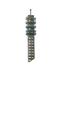 In this view I've already changed the colors. I wanted it to look more gray rather than blue. It's easier to see the difference when the image is all together. Here's the intermediate step. The tower is how I like it, and the sky is the next step. This is the new tower overlaid on the original background.
 Now it's back to the layer mask. I kept the white one from before so I could modify it. I had to exclude the lower part because I don't want to change that. Here's what the sky layer mask looked like.
 And here's what the layer looks like with the layer mask applied:
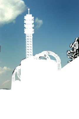 In this picture I've already edited the sky. I just changed the colors a little with color balance and curves tool. You can see all the little places where the sky is peeking through the sculpture and the tower. So here's the final picture. I like how it turned out.
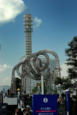 I hope you enjoyed it. I tried to keep the detail to a minimum and I skipped some steps in the blog so if anybody has any questions feel free to ask for more clarification. Thanks for reading.
Here's a side-by-side to make it easier to compare.


1 Comments:
That's an awesome job babe! I'm glad you have something to keep you busy on your off hours.
Post a Comment
<< Home